Responsive Web Design
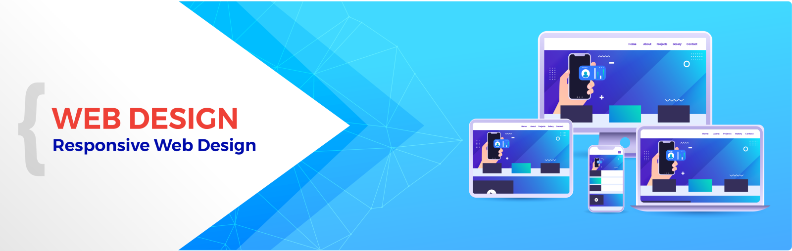
Responsive Design, also called Mobile Compatible Website, aims at the easy view and track of the contents on mobile phones and tablets for “now”.
Technological developments keep producing new products. No matter how good the contents of your company will be, it will have a less possibility to appear in the market if it fails to prove itself in tools and systems produced with new technology. Considering the recent past, we see that these technological developments are extremely fast. For example, following the electronic media and journalism, television first appeared, and then we switched to computers with a fast transition. However, this was not the last innovation. Afterwards, cell phones and tablets came into our lives. If you only express yourself only on TV to bring forward your Corporate Identity, you will lose a lot of target masses. Therefore, you should target existing in all the technological tools used by the masses. As DEMİRCODE, our aim is to ensure that our WEB Designs comply with the media of many internet providers, from tablets to cell phones. Accordingly, your Corporate Web Design will be up-to-date in new technological tools whenever there is a new technological development. This is briefly called Responsive Web Design.
What is the use of Responsive Design?
Responsive Design, also called Mobile Compatible Website, aims at the easy view and track of the contents on mobile phones and tablets for “now”. Figuratively speaking, you describe the route to your house over the highway for someone who wants to come with a car, and through the paths for someone who is coming with a bicycle. The same way, mobile use provides people with ease of use. When there is a technology offering this opportunity, you need to offer your customers this opportunity as well.